


Everyone knows XCOPY. XCOPY is one of the most famous of all NFT artists. XCOPY has sold millions of dollars of work and is truly an icon because the work is almost always instantly recognizable as XCOPY. As I was thinking about Motion Art recently I realized that XCOPY was a great example of the ideas about motion and gif art that I have been writing about here for the past three years.
So what is it that makes XCOPY’s work special?
The answer lies in two parts: the illustration + the motion.
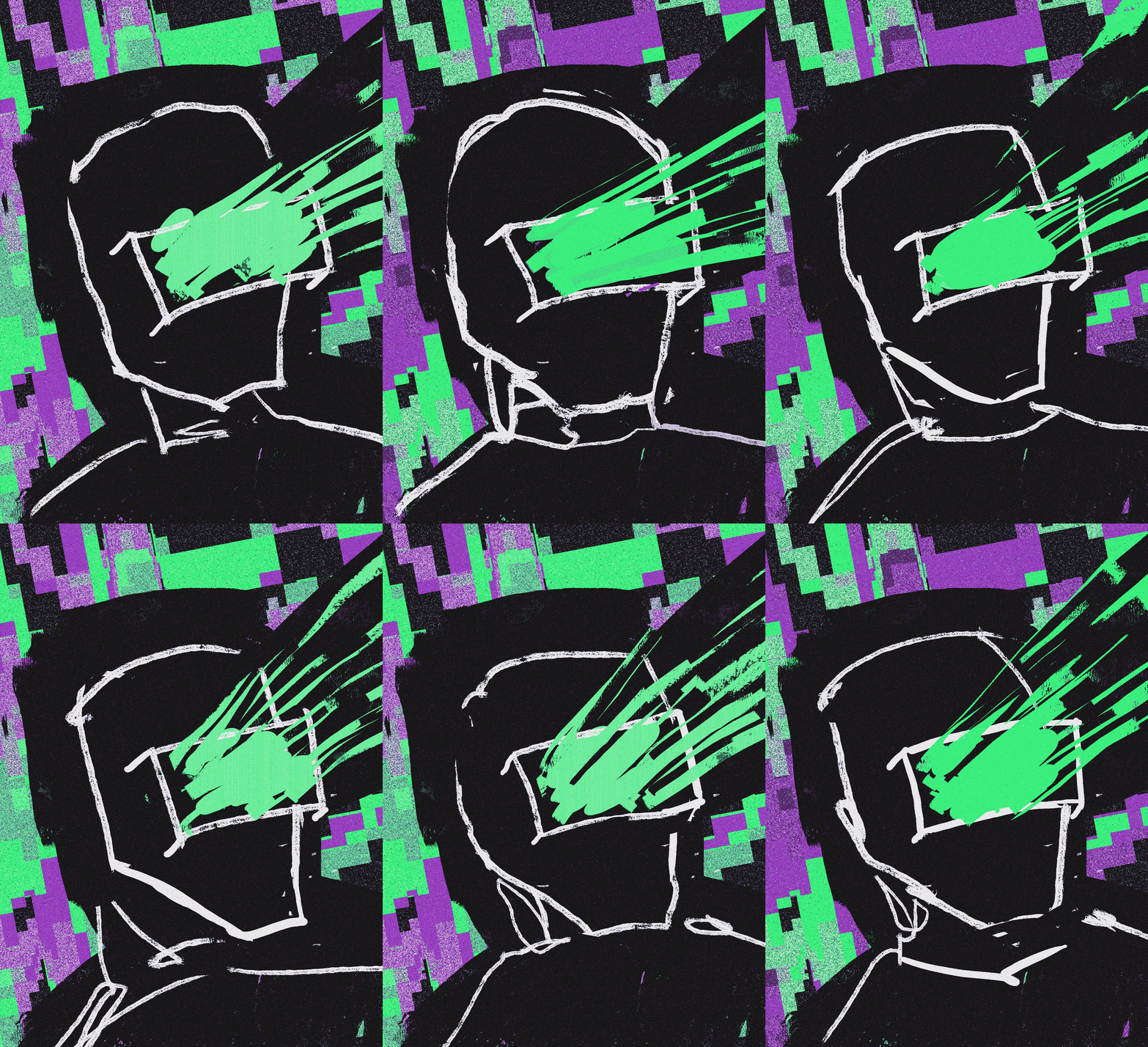
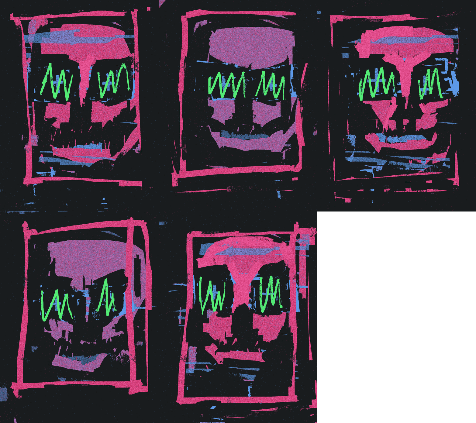
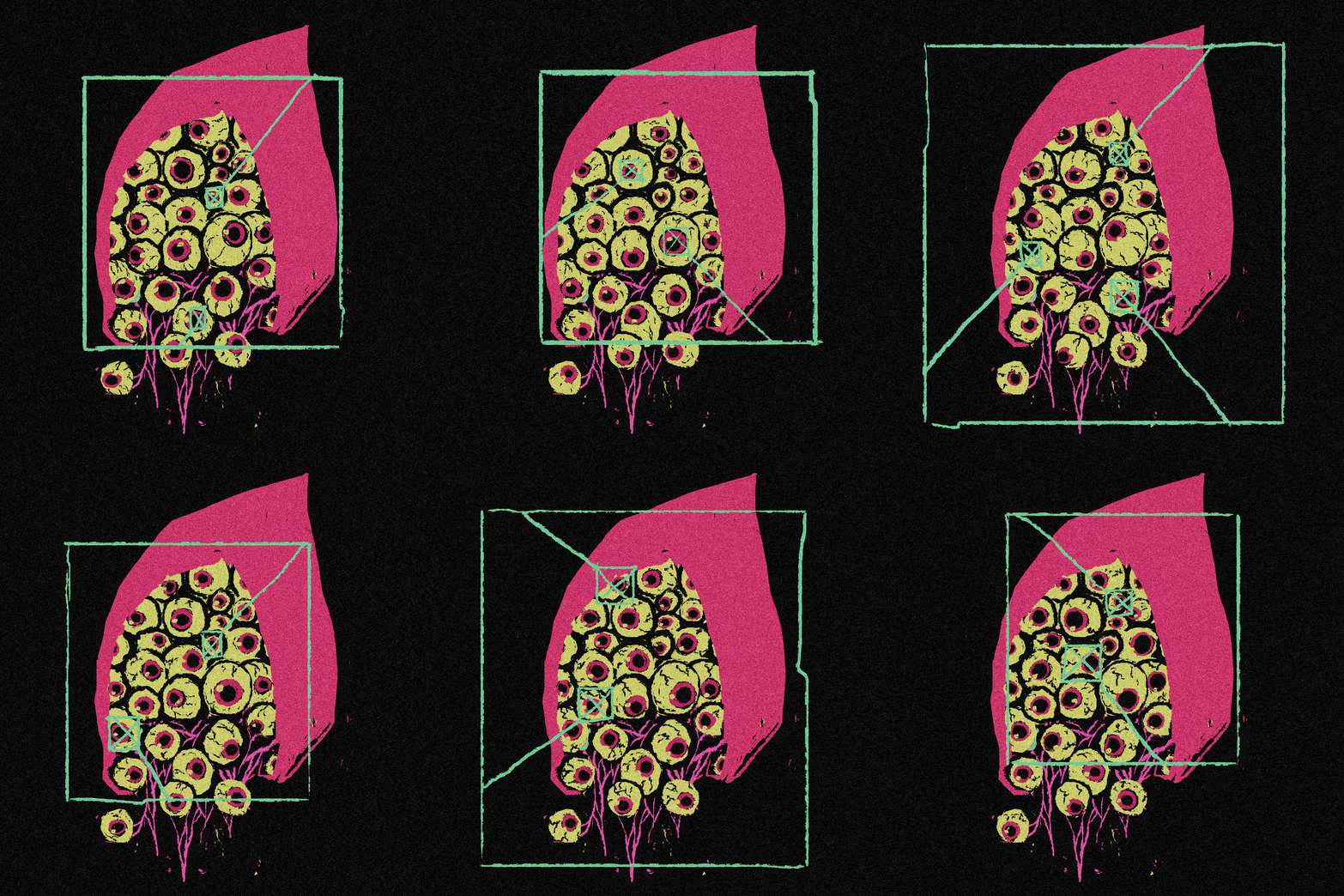
And these two parts are truly equal. XCOPY is an excellent illustrator and on the strength of that alone the work is good. The rough-edged, simplistic shapes with minimal colors and glitch elements, almost always on black, is striking. The amount of detail is always just right - a perfect balance between representation and abstraction.
But where XCOPY becomes XCOPY is in the motion. XCOPY varies key elements of the initial drawing over time to where it becomes something new, something with great energy that feels alive.
The motion is simple, just a few frames, but there is great restraint and aesthetic judgment there, and I am sure much trial and error goes into making the final decision about which few frames compose the final. You can feel that because when you look that the work together you can feel the consistency of the motion. Animators have many choices for how to vary what they do from frame to frame. And these decisions are what transforms a once static image into an XCOPY, something new.
You can easily see this if you are looking through XCOPY’s work and come across a rare static work. It feels completely different. It feels kind of...dead. What make XCOPY unique is the illustration + the motion.
This is why I say this is a new aesthetic that is only possible because we all now view art on a screen with a computer behind it.
And there is a great history behind it because the work of XCOPY is a pure representation of gif based motion art, which goes back to the glory days of Tumblr and the period of 2009-2014 when many great gif artists were developing their work. Beeple came out of this period also, but what is different about Beeple is that his work is primarily static while the work of XCOPY is based in motion.
You could have a gallery exhibit of Beeple’s work as high res prints but this would never make sense for XCOPY. The work would have to be displayed in motion so a gallery would have to have large panels that could display the motion, because that is the Art: the illustration + the motion

Follow David Koblesky.
Twitter - Website - KnownOrigin - Foundation - Hic Et Nunc
Learn how to earn.
Become part of our community.
Follow our socials.
Subscribe to our podcast.
Subscribe to this publication.
It’s free (for now)
Dope! Great to have you writing here David.
I've been following XCOPY for a while and I like his style.
Years ago I used to play a mobile game called BBtan. It was very popular at the time and was addictive. When I saw XCOPY's art, I immediately thought of that game. I guess because of the colors he used. It has a bit of a retro feel. Especially the neon colors used on the black background are very striking and allow us to look at the screen for a while.
There may be some who think that his job is easy, but he draws every single frame as it should be. Even in the drawing phase, he thinks about the animation phase. And he have to. There are endless options in art and design, and it's not easy for the artist or designer to decide. There are definitely too many trials to be able to make the final decision.
Lines: simple, colors: simple, animations: simple... Maybe we need to find the complexity in this simplicity. Not everything has to be physically complex and XCOPY shows us that to the fullest.
It was a great article. The games I used to play, my old Tumblr days... It took me back in time. That's the power of the art!
Many thanks for the article.